 04
Mar
04
Mar
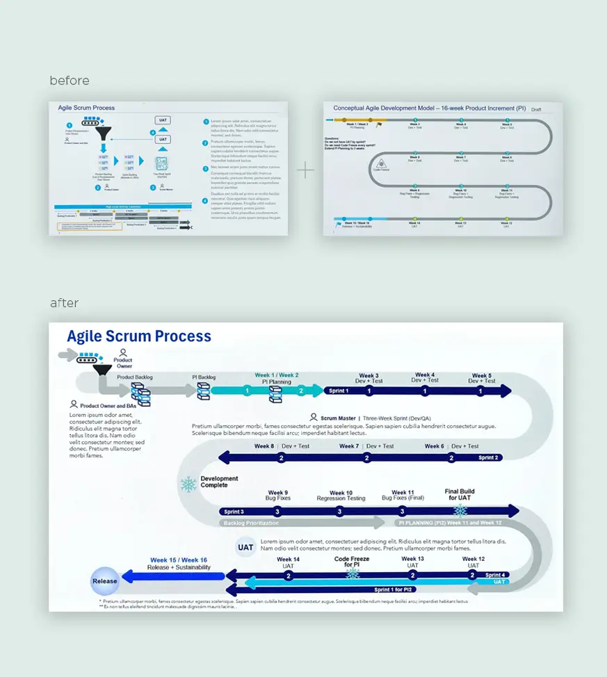
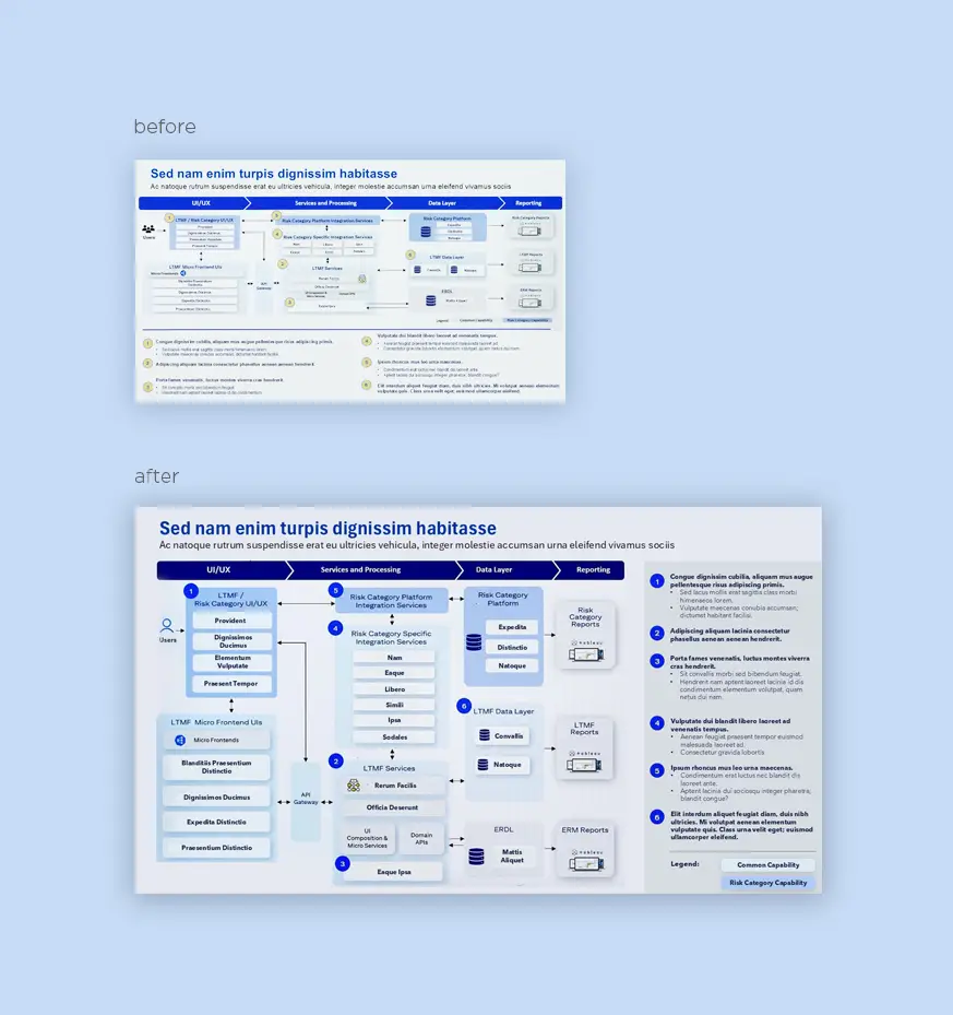
Risk Category Report Upon reviewing the layout, I observed that the steps at the bottom of the page lacked visibility. To address this, I repositioned them to the right, ensuring better alignment with the process flow. I then incorporated the brand’s signature colors and icons, elevating the design’s professionalism and visual coherence.
 04
Mar
04
Mar
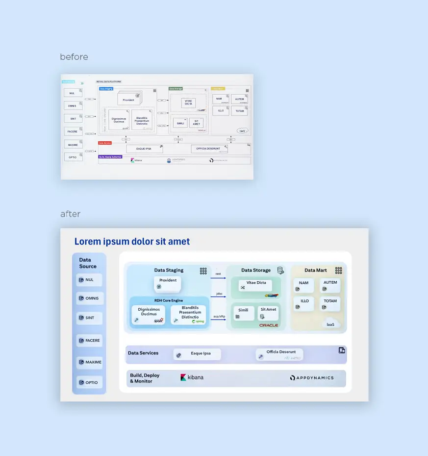
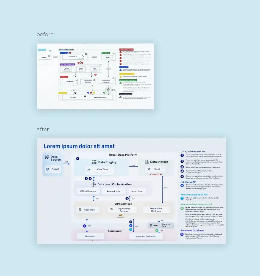
Data Process Flow For this Data Process Flow, I integrated branding colors to establish a cohesive visual identity. To emphasize the data, I accentuated it with bold highlights, while toning down the backgrounds with muted shades. This approach not only draws attention to the key information but also clarifies the overall process.
 04
Mar
04
Mar
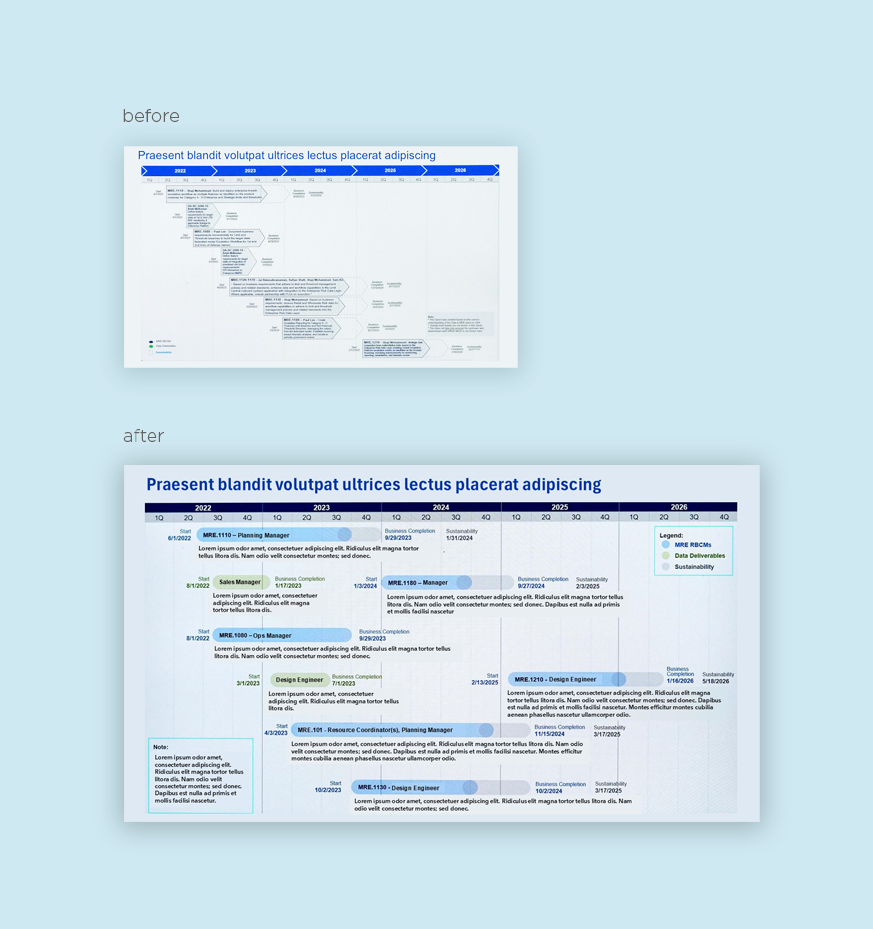
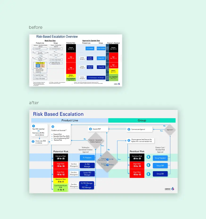
Risk Based Escalation During my review of this process, I identified two key components—Group and Product Line—and aimed to make them more prominent. I integrated the steps into the table for greater clarity. Through multiple team revisions, we uncovered redundancies, enabling us to streamline the process further.”
 04
Mar
04
Mar
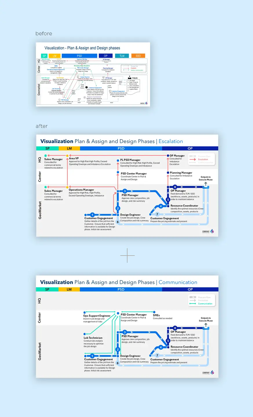
Visualization Phase The initial process was difficult to navigate due to overlapping lines scattered across the page. I also observed that the header included unnecessary departments not reflected in the process, so I removed them to optimize space. To improve clarity, I split the process into two slides, distinctly showcasing the escalation phase and the
 07
Sep
07
Sep
To preview the training, click here.